Suitable charts for different data types
Posted on 2020-12-04
Quite frequently, we will encounter different data types while handling an analytics projects. Here we discuss the most common visuals and charts that could prove useful to specific data types.
Textual Data
Aside from numerical figures, texts can now be analyzed too. With the advent of the internet, there are a lot of text data that are available online. But text data are one of those data types that is a bit difficult to analyze and show representation with. One good visual that can make sense out of text data and aid our analysis is the wordcloud.
Below is an example of using a wordcloud in analyzing the content of an article in Wikipedia about Data Science. With this charting technique, we can determine which are the most common words associated with data science. The first 100 sentences were considered in plotting the word cloud and Python was the tool used. As you can see, statistics, data, machine learning and visualization are some of the words that stand out in the wordcloud for the Data Science article in Wikipedia – and these words are definitely highly related to field of data science.

Numerical Data
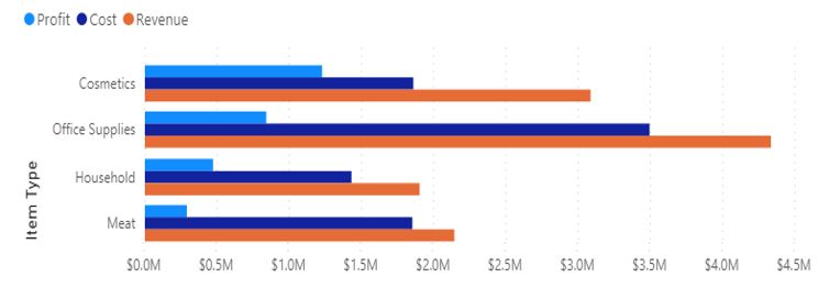
Data that is measurable are considered mostly numerical in nature. Most of the time, these data are continuous. One of the basic charts that can be used is the Bar Chart. This chart can be used to compare different measures for a variable. In this example, we can compare the Revenue, Profit and Cost for a certain product types.
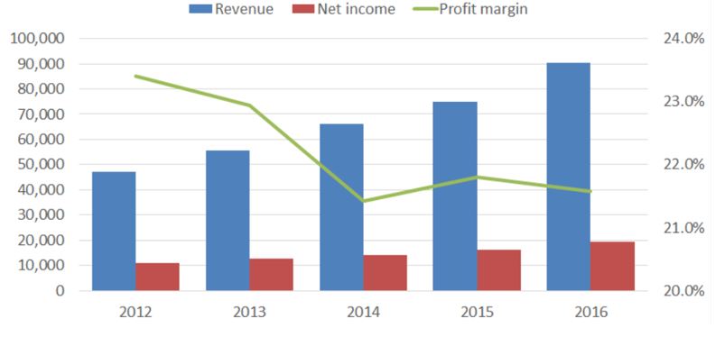
Also, Line Charts are particularly useful in plotting continuous data. In the chart below, we superimpose the line chart of profit margin to the revenue and net income.
Candlesitck Charts
In the trading industry, Candlestick Charts are the standard visuals. This particular candlestick chart follows the exchange rate of the Cryptocurrencies Bitcoin (BTC) and Ethereum (ETH).
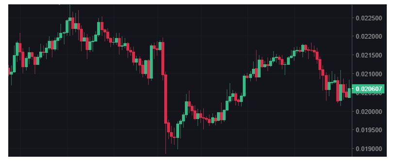
A Green Candle is known as a Bullish Candle and the Red one is a Bearish Candle. A Single Candle represents the price action in a specific time period. In this example, a 12-hour window is used, which means in a span of 12-hours, we can observe the variation on prices. The end of the candle body shows the opening and closing price and the the thin lines attached are known as either Tails, Wicks, or Shadows. The tail shows the lowest price - for the lower tail and highest price - for the upper tail at that particular time period.
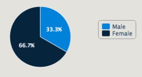
Categorical Data
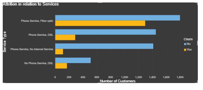
One may also encounter data that are under certain groups. These are called categorical data. For four or less categories, a Bar Chart may suffice. For example, this chart which shows the absolute count for Customer Churn given different combinations of their Phone Service and Internet Service subscribed to.
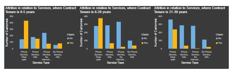
However for more than four categories, it would be better to show multiple grids. In the same example, a further category referring to Contract Tenure might yield more information than taking the population as a whole.
Location Data
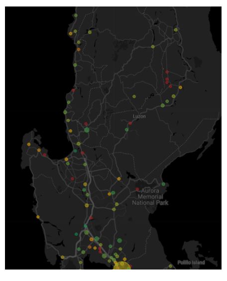
Finally, one may also encounter specialized types of data, for example, geolocation data. These types of data are mapped out to specific geographical location. In this example of logistics services, the plots represent the location deliveries. Additionally, delivery volume is represented by the bubble size.
And there we go, these are just some of the basic data types and possible representations for different types of data.
Click here to know more about the advanced analytics and data science services by N-PAX. For consultation, you can contact us at this section.
Recent Blogs